Enjoy and share your opinions in the comments.
Jan. 14 - added Tinkoff, Giant and IAM.
Pro Teams
AG2R LA MONDIALE (ALM) - FRA
 |
| Overall: 8 / Improvement: Yes / More brown! |
BELKIN-PRO CYCLING TEAM (BEL) - NED
 |
| Overall: 7.5 / Improvement: Yes? / Is that a new tone of green? |
BMC RACING TEAM (BMC) - USA
 |
| Overall: 7 / Improvement: Same / "Just use whatever you have left from last year, boys!" |
CANNONDALE (CAN) - ITA
Waiting for better images.
FDJ.fr (FDJ) - FRA
 |
| Overall: 6.5 / Improvement: Yes (if blue will be their main color) / Very similar to last year's blue kit, which was nicer than the white. |
GARMIN SHARP (GRS) - USA
 |
| Overall: 7 / Improvement: Yes / More white and a panda. |
LAMPRE-MERIDA (LAM) - ITA
 |
| Overall: 7 / Improvement: Yes! / Love the darker blue. |
LOTTO BELISOL (LTB) - BEL
 |
| Overall: 7 / Improvement: Not sure / Radical change, but is it better? |
MOVISTAR TEAM (MOV) - ESP
 |
| Overall: 7.5 / Improvement: Meh. / I do like the addition of the green bands on collar and sleeves. |
OMEGA PHARMA - QUICK-STEP CYCLING TEAM (OPQ) - BEL
 |
| Overall: 6 / Improvement: Slight / Got rid of the hideous half-tone gradient. |
ORICA GreenEDGE (OGE) - AUS
 |
| Overall: 5.5 / Improvement: Same shit, different year |
TEAM GIANT SHIMANO - NED
 |
| Overall: 4 / Improvement: YES! Hideous, generic jersey, but NO more white shorts! |
TEAM EUROPCAR (EUC) - FRA
 |
| Overall: 5 / Improvement: Whatever / No comment. WTF. |
TEAM KATUSHA (KAT) - RUS
 |
| Overall: 5 / Improvement: Nope / Still looks like a shitty club jersey. |
TEAM TINKOFF-SAXO - DEN
 |
| Overall: 6.5 / Improvement: Sure / Looking more like the Swedish National Team, but it's nice. |
TEAM SKY (SKY) - GBR
 |
| Overall: 8 / Improvement: Nope / Adding more logos, ugh. |
TREK FACTORY RACING (TFR) - USA
 |
| Overall: 7 / Improvement: Yes? / I go back and forth on this one. The simplicity is nice. Love the pintripes. |
Pro Continental Teams
IAM CYCLING - SWI
 |
| Overall: 8 / Improvement: Yes / Easily my favorite new kit. The Swiss flag detail on the chest is very elegant. Love it. |
TEAM NETAPP - ENDURA (TNE) - GER
 |
| Overall: 6.5 / Improvement: Obviously not / No, it's not a joke. |
ANDRONI GIOCATTOLI (AND) - ITA
 |
| Overall: 3.5 / Improvement: Nope / Why do they even bother? Might as well just wear Affliction T-shirts. |
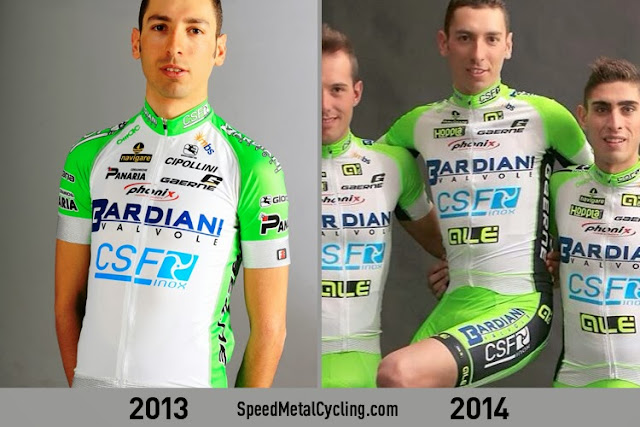
BARDIANI CSF (BAR) - ITA
 |
| Overall: 4 / Improvement: Nope / Barforama. |
BRETAGNE - SECHE ENVIRONNEMENT (BSE) - FRA
 |
| Overall: 7 / Improvement: Yes / I liked the grey, but the white looks nice. If they had black shorts, it's be a solid 9. |
MTN - QHUBEKA (MTN) - RSA
 |
| Overall: 6.5 / Improvement: Yes / Not much you can do with that shitty MTN, logo, huh? |
RUSVELO (RVL) - RUS
 |
| Overall: 3.5 / Improvement: Nope / God awful! |
UNITEDHEALTHCARE PROFESSIONAL CYCLING TEAM (UHC) - USA
 |
| Overall: 7 / Improvement: Yes! / Proof that you CAN do something decent with 29 logos. |
WANTY - GROUPE GOBERT (WGG) - BEL
 |
| Overall: 2 / Improvement: NO! / The worst kit of the year, so far! HORRIBLE. TERRIBLE. |


Don't like the Lotto Belisol change - the two-colour shoulders worked for me; I thought that was quite snazzy. I like that at least one team is promoting wildlife protection if only at the most superficial level. What I really want to see is Argos-Shimano's new kit because Warren Barguil tweeted that the colours were going to change, And rumour is that the name will change as well. But can you trust Twitter, really.
ReplyDeleteYeah, I know the name will change, can't wait to see that. Trek has been known to do nice things, so I'm also eagerly awaiting that one.
DeleteLampre is less bubble gummy - boo!
ReplyDeleteUnited Healthcare = Blackburn Rovers
ReplyDeleteYES! Can't believe I didn't think of that.
DeleteIt's nice to see that BMC made an effort to update their look.
ReplyDeleteJust sent you the new jersey for what was Vini Fantini via Twitter – is it possible to award minus scores?!
ReplyDeleteI saw that. I think an intern designed that. An color-blind intern. In the third grade.
DeleteOne of my favourite kits, my lack of taste upsets me.
DeleteNot that I care about this team, but I read that the UCI rejected the Androni Giocattoli jersey because it had too many logos.
ReplyDeleteAs for a team I DO care about, I can learn to love the Giant-Shimano jersey, especially considering who is wearing it.